Color Matching Tips: Style Guide to Stunning Looks

THE ART OF COLOR
How to Create Stunning Color Matches That Turn Heads
In a world where self-expression defines identity, color isn’t just visual — it’s emotional, cultural, and deeply personal.Mastering the art of color combinations isn’t just a skill — it’s a statement.
1. Understand the Psychology of Color
Before diving into tones and hues, recognize this: colors evoke emotions.
Red is power and passion.
Blue offers calm and intelligence.
Yellow radiates energy and optimism.
Black whispers elegance, while white speaks clarity.
Ask yourself: How do I want to feel today? Then, let your palette speak for you.
2. The Rule of Three: Base, Accent, Pop
An effortless color match often starts with a clear formula:
-
Base: Your dominant color (often a neutral — black, beige, cream).
-
Accent: A supportive tone that adds structure (brown, gray, navy).
-
Pop: The unexpected spark (electric green, crimson, butter yellow).
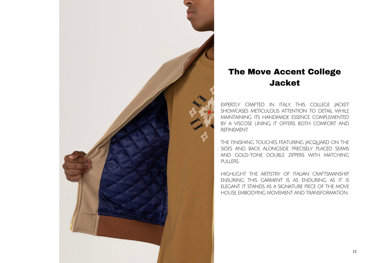
Example: Cream trousers (base) + chocolate brown knit (accent) + fire red shoes (pop). Effortless with a point of view.
3. Cool vs. Warm: Stay in the Temperature Lane
Mixing warm tones (burnt orange, camel, terracotta) with cool tones (lavender, mint, slate blue) can be striking — when done with intent. But when in doubt, staying within one temperature creates harmony and timelessness.
Earthy browns with olive green? Understated luxury.
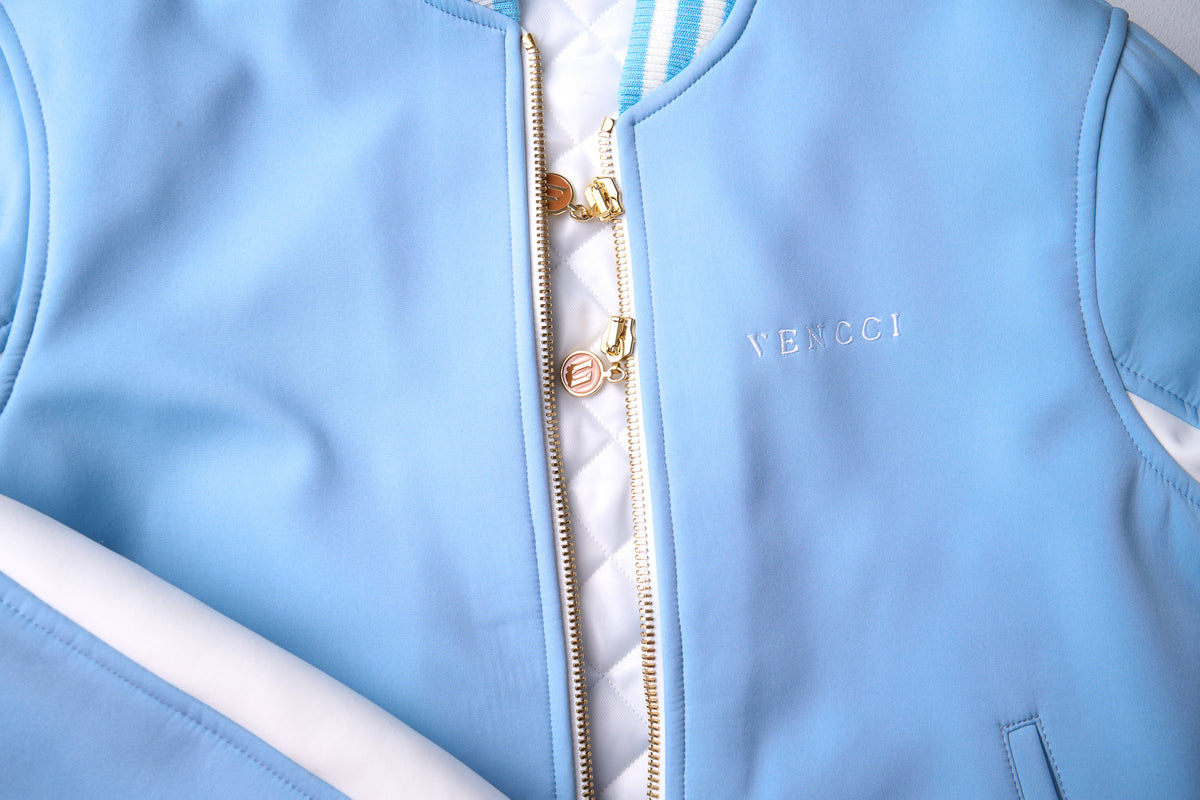
Sky blue with steel gray? Clean, architectural.
4. Color Blocking vs. Tonal Dressing
-
Color Blocking creates contrast. Think cobalt and lemon — bold, directional.
-
Tonal Dressing layers variations of the same hue — beige with sand and taupe, for instance — subtle and elevated.
Let mood guide the direction: bold when you want to stand out, tonal when you want to glide quietly with presence.
5. Texture Adds Dimension
Two items can share the same color, but when the textures shift, everything changes. Satin, wool, denim, leather — these elevate the dialogue between colors. A monochrome look in varying fabrics often says more than a clash of prints.
Closing Note
Combining colors is less about rules and more about rhythm. It’s about choosing how you show up — whether in a tailored coat or a relaxed silhouette, a monochrome moment or a vivid clash. What you wear is your language. And color is your tone of voice.
Let it be intentional. Let it be personal. Let it be yours.

0 comments